UX Content Collective Fundamentals Final Project:
The Handshake App
Handshake is a fictional app created by the UX Content Collective as part of the final project for their UX Writing Fundamentals Course.
Here’s the basic idea they laid out:
Business Owners use the app to pay freelancers and track the progress of hours worked (paying and tracking)
Freelancers use the app to bill Business Owners and report progress on a paid project (billing and tracking)
The app is “shared” by these two user types. Each of these users has a view of one side of the app: one uses it for billing and the other for paying. You can assume that these two users already know each other and have agreed to work together
Target users
-

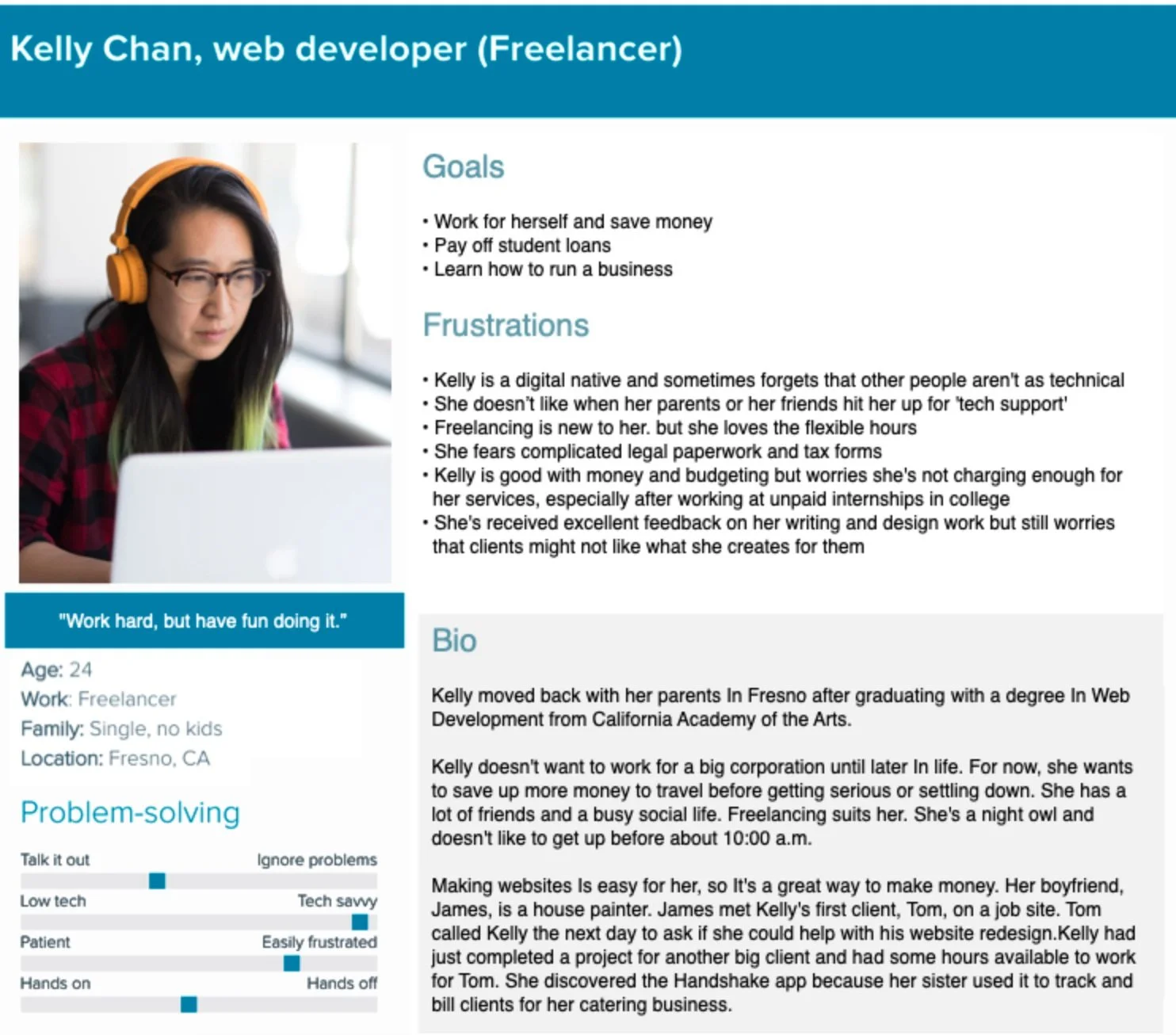
I was given two personas to research. These fictional examples represented Handshake’s target user types.
-

Both user types would use a different side of the app. Each side would require a slightly different user flow and different UI copy.
Research
-
I utilized conversation mining to find terms that our target users are using regularly. This helped me empathize with the users, start to refine some early ideas for voice, and pinpoint preferred terms.
I discovered a shared language. From that, I pulled some relevant terms that both freelancers and business owners would use when discussing business together.
-
I researched apps and websites that offered similar services to Handshake such as popular gig economy apps, payment apps, and tax programs.
-
It just so happens that I know both freelancers and business owners. Friendship is magic.
I was able to get a feel for what emotions our target users would be feeling when using the Handshake app.
Freelancers might have doubts about tracking their time and progress when they’re used to clients simply paying for a completed project regardless of time. Will more experienced web developers end up simply charging significantly more per hour? More direct supervision of a developer’s progress and project milestones may seem like the kind of supervision a freelancer wished to avoid when going into their chosen field.
Business owners might feel anxious to see if a hired freelancer is performing on schedule and as expected, appreciative of it being easy to track the status and communicate with freelancers, appreciative of it being easy to pay when the job is done or at agreed-upon installments
Ideation
Okay, time for this thing to take shape!
Moving from research to solutions, I worked on example onboarding emails, error copy, and headlines. During this phase, I began to lock down preferred terms that I’d include in the Handshake style guide. This was an ongoing process and I went back and forth on a few preferred terms even as I began mockups.
Brainstorming headlines!
Style Guide
I was genuinely excited to write this.
With user-focused research in hand, I defined what Handshake would sound like. I found the product’s voice. I mapped out when and where the tone would shift and I showed our team what stylistic choices would most benefit the user for a clear and consistent experience. I made sure to explain my reasoning so that all (hypothetical) team members were on board.
The goal here was to create copy that eased our user’s cognitive burden and alleviated friction at likely drop-off points.
Creating the style guide really solidified the importance of understanding the entire user flow as a UX writer. As soon as I dove into the design mockups, I got a better feel for how the UX copy actually interacted with the user flow. It was clear I needed to edit some of my preferred terms. Careful not to be too precious with my work, I made some changes.
Check it out.
Mockups
It was my job to review the wireframe mockups in Figma and provide all the UI text needed for an upcoming design presentation and review.
Onboarding
-
Before
It’s a start, but these welcome screens were far from finished. They didn’t reflect the voice. tone, or stylistic choices highlighted in the style guide.
User’s asking “What next?” would have a lot of trouble even signing in. It’s our job to help answer these questions.

-
After (edits in magenta)
I edited these screens to be more in line with our style guide. I also suggested a series of helpful onboarding screens based on the headlines I wrote to show the various awesome advantages of the app. Finally, I made a note to avoid a big design flaw here. They should consider splitting up the sign-in and create account steps. This will reduce cognitive burden and allow users to focus only on what’s relevant to them.

Setup Screens
-
Before
This is where the app splits into two distinct user flows.
The top part of the flow is for business owners or “clients” while the bottom part of the flow is for freelancers.

-
After (edits in magenta)
I edited the headings and all copy for parallel structure. It was important to shift to a more enthusiastic tone for the lightbox indicating that the project started.
I also added some helpful tooltips and instructional microcopy to help the project setup process along.
Setting up payment can be a major drop-off point so I suggested adding more options if possible.

Project & Messaging
-
Before
There’s a significant design element missing here: A “My Projects” home screen where users could switch between and track multiple projects.
After looking at these screens I realized I didn’t understand the function of certain elements of the UI, particularly in the “Time” screen.
The “+” isn’t intuitive. Should there be a separate “Save” button to add hours?

-
After (edits in magenta)
I cleaned up these screens and made sure users on both sides of the app had access to all the information they needed. I left design elements mostly intact, but there were a few instances where subtle design changes both served the user and helped me do my job as the UX writer.
It’s important that no payments are sent before confirmation so I added the “Go back” and “Confirm” buttons to the lightbox.
I also suggested redesigning the messaging UI to look more like a chat.

Results
Upon reflection, there were some elements of design and UX copy in these prototypes that warranted additional testing. Both A/B testing and usability testing would give us valuable data about the design and overall user experience. I suspect components of the UI such as messaging, payments, and account setup most likely required additional screens and/or redesign.
There were other challenges as well. For example, the payment selection process was unclear. Since both sides of the setup flow had an option to select their preferred method, how do they agree?
One possible solution was that whichever party is “inviting” has their preferred payment type automatically selected when their partner joins.
One of the biggest challenges this app will face from a marketing as well as a UX perspective is that the users must know each other before using the app. There is no search or match feature within Handshake. This means that they both agree to work together first. The awareness/discovery part of the user experience is completely out of Handshake’s—well…hands.
Once a freelancer and their client already know each other and decide to work together, Handshake will be hard-pressed to sell its services when it might be easier (and cheaper) to just work within a payment app like PayPal and track progress on a spreadsheet.
I made sure to pass along these suggestions to senior design and management in the hopes that they’d improve the next iterations of Handshake.


